
Site Operations Portal for The Home Depot
Overview
Company: The Home Depot - Enterprise Team
Product: Site Operations Portal
Purpose: Internal monitoring and incident response platform used by Site Reliability Engineers
Device Type: Desktop
My Role: UX Designer.
Tools Used: Sketch, Marvel
The Problem
The site operations portal was created to replace a legacy system that was used to monitor the health of the company’s e-commerce site as well as the applications supporting the product purchase lifecycle. This tool plays a critical role in ensuring site stability, performance, and revenue protection.
The legacy system was difficult to read and inefficient to use, especially during high pressure situations. because of this, the Reliability Engineers responsible for addressing site issues were not easily able to identify when a problem arose or understand where it originated.
The e-commerce site, Homedepot.com , supports a high volume of daily transactions. So even short disruptions or degraded performance can have a significant business impact. Improving the usability of internal monitoring tools directly supports site stability, faster incident response, and reduced revenue risk.
Example of the old experience illustrating the clutter and ambiguity users experienced
Key issues with the existing system included:
Poor readability and hierarchy
Important metrics were buried in dense layouts, making it difficult to scan or prioritize information quickly.
Limited visibility into trends and time ranges
Engineers struggled to focus on specific time spans when investigating issues, slowing diagnosis and response.
Minimal data visualization
The system relied heavily on raw numbers and tables, requiring engineers to mentally process patterns that could have been surfaced visually.
High cognitive load during incidents
Instead of supporting rapid decision making, the interface added friction during moments when speed and clarity were critical.
Discovery
User Interviews
I conducted interviews with Site Reliability Engineers to understand how they used the existing system and where it fell short.
Key questions included:
• What information do you look for first when something goes wrong?
• What slows you down during incident investigation?
• What do you like and dislike about the current system?
• What would help you work more efficiently?
These conversations revealed a strong need for clearer visual signals, better prioritization of metrics, and easier isolation of issues across time ranges.
Collaborative Design
Design studio sessions
I facilitated a design studio session with the product team. Product managers, software engineers, and UX partners. We explored multiple layout concepts, aligned on technical constraints, and prioritized which metrics mattered most to the Reliability Engineers.
Testing and Iteration
User testing was conducted to validate layout decisions, visual hierarchy, and information grouping. Feedback from testing and interviews was synthesized and used to iterate on the design. This process was repeated as needed to improve clarity and usability.
Wires to High Fidelity
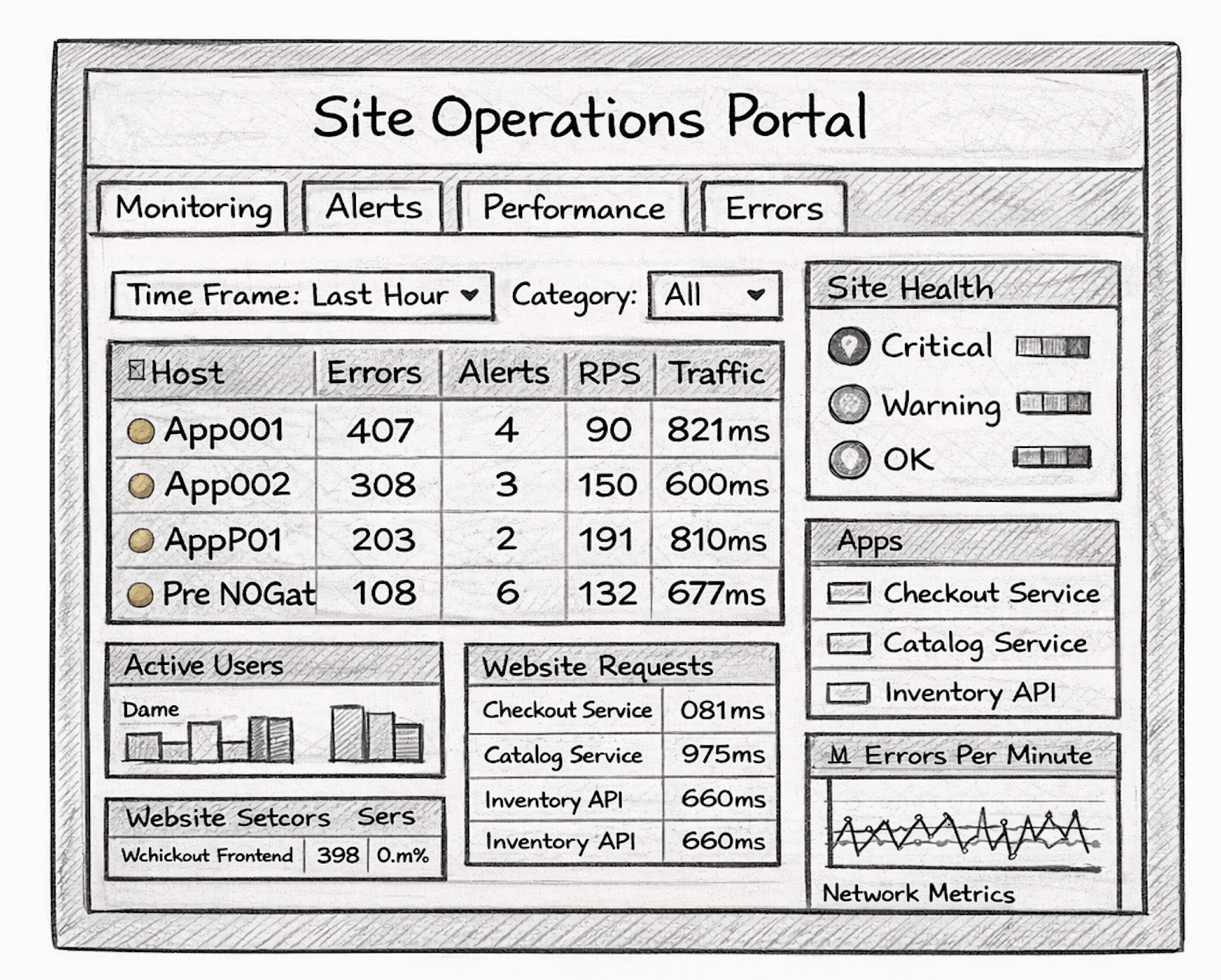
Based on research insights, I created wireframes that focused on:
• Clear visual hierarchy of critical metrics
• Modular dashboard sections
• Scannable layouts
• Strong use of charts and visual indicators
Outcome
The redesigned Operations Portal replaced the legacy system with a clearer and more modern experience tailored to the needs of Site Reliability Engineers.
Key improvements included:
• Improved readability and scannability
• Faster identification of system issues
• Clearer prioritization of critical metrics
• Better use of data visualization
• Reduced cognitive load during incident response
The new portal provided a stronger foundation for monitoring site health and responding to issues efficiently.
Software Used
Sketch
Marvel