

Georgia Natural Gas - PEW
Client: Georgia Natural Gas www.gng.com
Company Mission: Provide natural gas service to over 1.6 million customers in residential and commercial locations across the state of Georgia.
Product: Plan Enrollment Wizard/PEW (New customer sign-up experience)
Device Type: Mobile, Desktop
Problems To Solve: The old sign-up wizard presents multiple usability challenges that create confusion and frustration for users. These challenges also contribute to longer wizard completion times for the customer, making it more likely that customers will decide to abandon their cart/sign-up flow before completing the wizard.
Some questions are ambiguously worded, making it difficult for users to provide accurate responses.
The wizard’s progress bar misrepresents the actual number of steps showing only five steps on load. Users are actually going through seven steps (basic flow), which creates a disconnect between expectations and reality.
Customers who have already provided their address before entering the wizard are still required to re-enter it.
When a customer enters the wizard with a promo code, there is no clear indication that the discount has been applied until the final Review & Submit step. This lack of transparency can lead to frustration and decreased user confidence. Other details such as, the customers selected plan are hidden from the customer for the majority of their experience.
Some customers are required to pay a connection fee in order to begin service with GNG. However, important details about that connection fee are not disclosed until after the customer has exited the PEW experience. This could cause frustration and lack of trust with new customers, decreasing the opportunity to gain their loyalty.
Paperless billing enrollment numbers are down. This is due to paperless billing enrollment happening only once the user has become a customer. This happens in the Account Preferences experience. More than 60% of customers were still receiving paper bills in the mail each month.
The client’s need to introduce a new feature called Bundles into PEW is hindered by technical limitations of the current experience, preventing a seamless integration of these new offerings.
Why Now: About a year before this project kicked off, I actually pitched a proof of concept for an updated PEW experience. At the time, our client pushed back with: “While we recognize opportunities to enhance the customer and backend experiences, we are confident in the performance of our PEW platform today.”. That was until they informed us they were ready for the site to undergo a full redesign. The time had come and I had finally been presented with the opportunity to improve the sign-up experience for the customers who interact with the PEW experience each year.
Old Solution
The old Plan Enrollment Wizard (PEW) reflects five step sign-up, but as we already know that number is inaccurate. In order to complete the sign up process and become a customer of GNG users must complete the following steps:
Step 1: Are you a current GNG customer?
Users who answer YES to this question are re-directed to the Online Price Plan Change experience for current customers.
Pretty straightforward but it seems unnecessary to dedicate a full step to this.
Step 2: Plan Set Up?
Are you switching from another gas company or do you want to start service with GNG?
If customers make the wrong selection here it can delay the start of their gas service.
This question is meant to determine if the gas connection is active at the time of sign up.
When no gas flow is present, the customer is prompted to select a connection date. This is an additional step in PEW.
Is this something that can accurately determined without relying on the customer to tell us?
We know GNG’s parent company, Atlanta Gas Light conducts regular meter reads and is aware of wether or not gas is flowing at a given location and if gas is flowing they know if it’s theirs or a competitors.
Step 3: Enroll in Greener Life?
All potential customers are prompted to join GNG’s Greener Life (GL) initiative. Greener Life is GNG’s sustainability initiative that works to decrease customers carbon footprints by purchasing and then retiring carbon offsets associated with natural gas usage.
This is the only add-on that GNG promotes to the customer in the sign-up flow.
Step 4: Service Location (Address)
Do we need to ask this to every single customer?
Certain customer addresses have already been collected from the customer prior to entering PEW.
Step 5: Confirm Plan Selection
Here, customers can keep their selected plan by confirming or choose a new plan. Users who want to select a new plan are taken out of the PEW experience and taken to the Plans List page.
What is the impact of asking the customer to confirm the plan they selected only seconds ago?
Step 6: Credit Verification
Every new customer’s credit must be verified to ensure they meet eligibility requirements for the plan they selected.
Customers who don’t meet eligibility requirements will be redirected and prompted to select an alternate plan, in order to continue their sign-up. This is an additional step in PEW.
Customer name and contact details are also collected in this step.
Step 7: Review & Submit
The final step of PEW gives the user an opportunity to review details related to their account, selected plan and pricing details, deposit amount (when applicable), connection fee (when applicable), and terms and conditions.
Customers that are asked to pay a connection fee are made aware of that on the Review & Submit page. But due to timing issues with internal systems at GNG the amount of the fee is not known until after the user becomes a customer.
Customers have the option to pay the connection fee in full on the first bill or split the fee across two bills. However, this information is not presented to the user until after they have become a customer.
How are we ensuring that important information is not hidden and potential customers are aware of what they are agreeing to?
Are we missing opportunities here? Ex. Collecting deposit payments, customer referrals
“Step 8”: Account Preferences
The progress bar labels this as the last step in PEW, when in actuality it’s a different app altogether.
After the customer submits their “order” the PEW experience is over and the customer is taken to Account Preferences (AC Prefs) and receive a success message letting them know they are officially a GNG customer.
Here, the customer can enroll in add-ons such as, paperless billing, Greener Life, and automatic payments. They can also able to select their connection fee preferences. However, most customers usually drop off here and most never return to complete these items, leaving missed opportunities for GNG and potentially causing future stress for the customer.
These add-ons are important to the client, as numbers are down and they have been tasked with increasing add-on enrollments in the year 2025.
How can we increase add-on enrollments?


Brainstorming and Collaboration


During this phase, the UX team (myself and my manager), 2 Creative Designers, 1 Developer and our Director of Client Services participated in a virtual design studio to sketch out some design ideas in Miro.
We knew we needed to pitch an idea to the client that would reduce the amount of cart abandonments during the sign-up process because of how long it takes to get through the process and how many decision points the customer encounters. This client can be a little conservative (and very opinionated) so we knew we had to come up with something creative but also something they would connect with. We used this opportunity to collaborate and share ideas that I would then take and piece together and ux it into a solution we could pitch to the client.
Some common themes throughout the teams ideas included:
Bundled plan options to help decrease decision making fatigue on the user and increase add-on enrollments for the client.
In this case, Bundle = Plan + Add-on + Discount
Expand and collapse sections to help increase page visibility and giving the user the option to decide how. much they want to see on the screen, as some of these pages can get pretty long at times.
Proposed Solutions
Proposed Solution 1-PEW Lite
PEW Lite is a POC I designed (one year prior to the actual project kickoff) in an effort to pitch a sleeker and faster version of PEW to our client. We’d just started having conversations with our client at the time about bundled plans and what that could look like for GNG.
First, I started by collaborating with my lead developer to brainstorm potential flow ideas and determine what the minimum pieces of information we needed to complete a customer sign up. Doing this required looking into the third-party API that GNG.com uses. This version of PEW was going to rely on collecting the minimum amount of information from the customer in order to reduce sign-up times, increase add-on enrollments, and push bundles (a new product for GNG.com). The minimum pieces of information needed for a customer sign-up are:
Are you a Switch, New Connection or Current Customer?
Service Address
First Name
Last Name
Email Address
Phone Number
SSN or TIN
Date of Birth
Agree to T&C’s

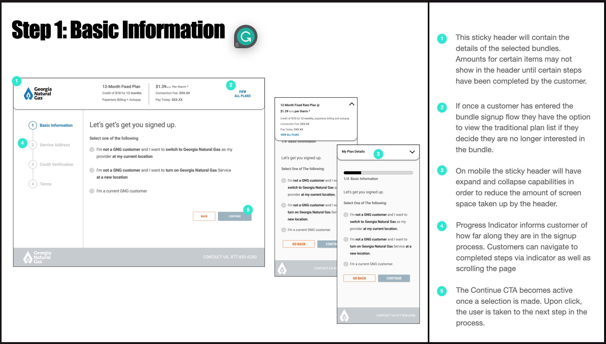


Wires of the Homepage w/Bundles and PEW Lite experience.
With this info, the sketches from our design studio and a bit planning/organizing, I began designing my wires. The designs reflected a four step sign-up process, called PEW Lite. The idea here is that once the customer lands on the homepage or on a bundled plans page, they are presented with multiple bundle offers, with each bundle including a plan, additional services and some form of discount. Once the customer selects the desired bundle they are taken into an PEW Lite, an abbreviated version of PEW.
In addition to the time savings PEW Lite provides for users, there is also a focus on keeping the customer informed throughout the sign-up. The approach here is a floating collapsable card that stays with them throughout the experience. The card provides informs the customer on details related to:
Plan Name
Plan Pricing
Discount
Discount Terms
Add-Ons
Add-On Pricing
Connection Fee
Deposit/Pay Today Amount
We pitched the POC to our to the client and the feedback we received was that they were definitely interested and wanted to explore the idea of Bundles and PEW Lite further but were more concerned with other priorities at the time. As well, they informed us that they legal considerations may shape how streamlined PEW Lite can ultimately be.
"We see great potential in Bundles and PEW Lite and are eager to explore them further. However, our current priorities take precedence.”
PROPOSED SOLUTION 2 - PEW 2.0
With the website redesign officially underway, we were ready to make some meaningful changes to PEW. To get things started the team (Myself, UX Manager, Dev Manager, VP of Strategy and VP of Client Services) got together to come up with a plan and talk through more ideas around improving the experience. From that meeting we aligned on some of the features and qualities the new PEW needed to embody:
A personalized approach (when possible).
How can we save time for the customer?
Seamless enrollment of Paperless Billing and Automatic Payment add-ons.
How can we increase add-on enrollments?
Complete and clear plan/bundle details.
How do we ensure transparency regarding relevant plan details?
An expanded abandon cart experience beyond what currently exists.
How can we make re-engagement efforts more impactful?
Capture referral codes in the experience.
How can we easily capture this information?
Collect payments when necessary.
How can we make it easier for customers to pay plan deposits?
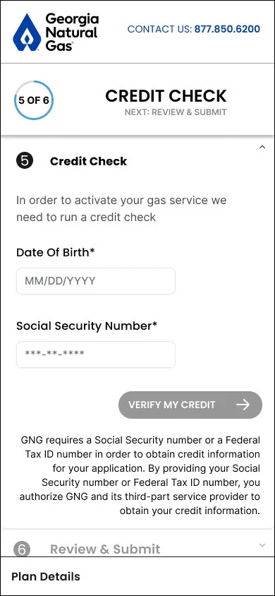
With the full site re-design officially in motion, I began designing the new PEW wires with the above questions in mind. Because our client opted not to conduct any research for this project, I leaned heavily on my PEW Lite feedback, sketches from the design studio, notes from my conversations with the dev team, and any insights I could gather on what the competition was doing in order to inform design choices in my wires. This flow collects all of the information needed from the user in order to make them a customer and also focuses the actual exerience and how we can make things easier and faster for the user. I also focused on creating flows of alternative paths. Those alternative paths are: Turn On, Failed Credit Check, Selected Plan No Longer Available, or Activation. Each of these paths represent an additional step in the flow. A user can encounter 1 or more alternative path during sign-up. There is an edge case where a user enters PEW with a Greener Life plan, in this case the basic flow is only four steps.
Over the course of the next 3 months, my work consisted of a weekly loop of design-present-feedback-iterate. This is a very hands-on client meaning, the wires went through countless revisions. During this time, I advocated for user testing to help answer some of our questions, but my request was denied and the weekly conversations and iterations continued. Finally, with client approval, my work was up to this point was complete and the flows were ready to be handed off to dev.
Steps in the basic flow include:
Service Address
Contact Details
Greener Life
Credit Check
Review & Sign Up
Steps in alternative flows may include:
Service Address
Contact Details
Connection Date (Prompted to customers who fall into the New Turn On bucket)
Greener Life
Credit Check
Alternative Plan (Prompted to customers that don’t meet credit eligibility requirements)
Review & Submit
New Experience Highlights:
Each step of the experience lives in an expand and collapse section.
More than 70% visitors of the site are using mobile devices and the expand/collapse format facilitates a less cluttered experience for the user and gives them the opportunity to choose how much information they want to digest.
Floating plan card that highlights the most important plan details follows the user throughout the experience.
This plan card is home to details such as: Plan/Bundle Name, Plan Pricing, Discounts, Add-On Incentives, Deposit Amount and Connection Fee Amount.
The card expands and collapses on demand.
Instead of dedicating a full step to asking the user if they are a current customer, I opted for an Already a Customer? CTA at the top of the page on step one. (Service Address)
PEW is a sign-up flow for new customers only. This gets the current customer to the right place faster and keeps the user/new customer from answering an unnecessary question.
In the case of a known customer, utilize third-party customer engagement tool, MoEngage, to pre-populate the users service address and/or other form fields. Social security number, taxpayer identity numbers, and date of birth are not stored and therefore never pre-populated. (Service Address, Contact Details)
MoEngage categorizes customers into known and unknown buckets by tracking IP addresses.
Utilizing personalization in PEW could improve sign-up completion times.
Customers have the option to enter a billing address that is different from their service address. (Service Address)
This is standard practice with sign-up/checkout expereinces and was previously unavailable.
Answers to the Turn On or Switch question have been rephrased with the goal of easing confusion for the customer. (Service Address )
The question was previously unclear and confusing. Selecting the incorrect answer can potentially delay the start of service.
Paperless Billing enrollment and applicable incentive integrated with email capture. (Contact Details)
Customers must now make a selection to opt in or out of paperless billing. Prior to the new PEW customers could only do this once they reached their Account Preferences page.
Provide the customer with the option to manage connection fee payments (Review & Sign Up).
Previously, information about the Connection Fee was not disclosed to the customer until after they’ve clicked Submit. Being more transparent about taxes and fees helps reduce pain for the customer.
Integrated a new abandon cart experience with the help, of MoEngage. Idle customers and customers attempting to exit prior to completing sign-up are prompted with pop-ups encouraging them to complete the sign-up flow.
Here we take into account when the customer idled/exited that experience and what information do we have from them. This is used to determine how things might look for the user, should they decide to return at a later time. (I created the user flows and MoEngage took care of the page elements)


Wrap-Up
With the client’s stamp of approval on the wires, we have now reached the handoff portion of the process. Working with a small agency means things can get pretty hectic at times, you’re often wearing multiple hats and most days the “process” is non existent. This was indeed one of those days, I was handing my wires off to development and the creative team at the same time.
The new website was launched in September of 2024 and my version of PEW active on the site and being used by more than 40,000 people each month. while I don’t have access to post-launch data, the redesign tackled major usability pain points, setting GNG up for higher conversion rates, faster sign-up times and more customer engagement.
Problems solved with the implementation of PEW 2.0:
Some questions are ambiguously worded, making it difficult for users to provide accurate responses.
Responses to the Turn On or Switch question have been rephrased with the goal of easing confusion for the customer.
The wizard’s progress bar misrepresents the actual number of steps showing only five steps on load. Users are actually going through seven steps (basic flow), which creates a disconnect between expectations and reality.
Reconciled the progress bar so that it accurately reflects where the user is in the flow and how much further they have left to go.
Unclear details around the connection fee.
Clarified that payment options for the connection fee before exiting PEW.
Add-On enrollment happens only once the customer has finished the PEW journey.
Integrate add-ons into PEW.
Customers who have already provided their address before entering the wizard are still required to re-enter it.
Implemented a personalization/abandon cart strategy that remembers information (address, name, phone number) previously provided by the customer.
When a customer enters the wizard with a promo code, there is no clear indication that the discount has been applied until the final Review & Submit step. This lack of transparency can lead to frustration and decreased user confidence. Other details such as, the customers selected plan are hidden from the customer for the majority of their experience.
Introduced the floating plan bar that contains details such as the selected plan, add ons, and promotional codes/discounts.
Some customers are required to pay a connection fee in order to begin service with GNG. However, important details about that connection fee are not disclosed until after the customer has exited the PEW experience. This could cause frustration and lack of trust with new customers, decreasing the opportunity to gain their loyalty.
Provided the customer with the option to manage connection fee payments before exiting PEW and entering a legally binding agreement with GNG.
Paperless billing enrollment numbers are down. This is due to paperless billing enrollment happening only once the user has become a customer. This happens in the Account Preferences experience. More than 60% of customers were still receiving paper bills in the mail each month.
Introduced customers to Paperless Billing and Auto-Pay add-ons before the customer exits PEW.
The client’s need to introduce a new feature called Bundles into PEW is hindered by technical limitations of the current experience, preventing a seamless integration of these new offerings.
Though backend limitations were still in place we implemented a work around that allowed for bundles to be presented to the customer.


