
Redesigning the Georgia Natural Gas Plan Enrollment Wizard
Overview
Client: Georgia Natural Gas www.gng.com
Company Mission: Provide natural gas service to over 1.9 million customers across residential, commercial, and industrial sectors in Georgia, USA.
Prototype created in Figma
If the prototype video is inactive, try closing the tab and returning to the page
Product: Plan Enrollment Wizard/PEW - Customer sign-up experience https://gng.com/enroll
The Plan Enrollment Wizard is the first impression new customers have of Georgia Natural Gas. More than 40,000 customers pass through this flow each month, yet the original experience presented significant usability issues. These issues caused confusion, unnecessary friction, and high abandonment.
Device Type: Mobile, Desktop
My Role: Senior UX Designer. I led the redesign of this experience during the full website overhaul, with the goal of creating a faster, clearer, and more transparent sign-up process that increased customer confidence and supported business needs such as add-on enrollments and new product bundles. I was responsible for user flows, wireframes, interaction design, concept development, technical collaboration, and stakeholder alignment.
Products Used: Figma, Miro, Jira, Teams, Outlook
The Problem
The existing wizard suffered from several major issues:
Turn-On vs. Switch
The wording of the options in the old experience were extremely confusing to customers. The wrong selection here can delay service connection.
Outdated Interface Design
The visual design created a noticeable gap in usability and accessibility while also making the interface feel outdated and less trustworthy.
Ambiguous questions
Critical questions, such as Turn-On versus Switch, were unclear, leading users to make selections that could delay service connection.
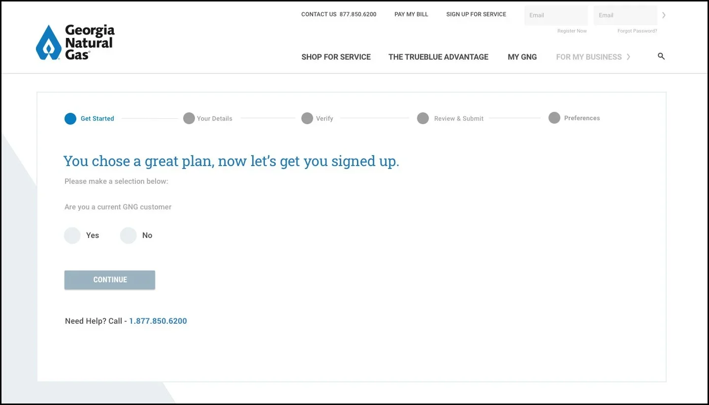
Misleading progress bar
The wizard displayed five steps, even though users moved through seven or more causing misalignment between expectations and reality.

Review & Submit
Customers are aware of plan pricing from the start of the process however additional pricing details are not shown to customers until the end of the flow
Repeated data entry
Customers who had already entered their service address earlier in the journey were asked to enter their address again during sign-up.
Lack of transparency
Promo codes, plan details, connection fees, deposit fees, and discounts were hidden until the end of the flow. Customers felt confused and sometimes blindsided, contributing to elevated drop-off rates late in the flow.
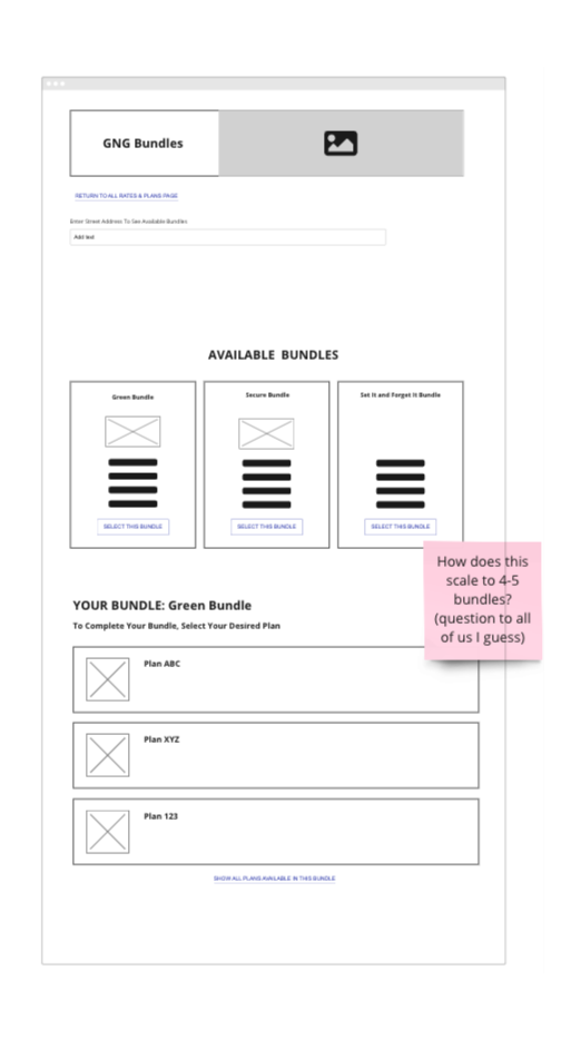
No support for new Bundles product
GNG wanted to introduce bundled plans, however, the old design was not technically equipped to manage plans as part of a bundle.

Account Preferences
After submission, customer a dropped into a new experience while the progress bar from the sign-up flow remains present.
Fragmented experience
After hitting Submit, customers were moved into a completely separate application for Account Preferences, yet the progress bar made it appear to be part of the wizard.
Disconnected add-on enrollment
Important add-ons such as Paperless Billing and Auto Pay were confined to the Account Preferences experience, where most customers dropped off.
Discovery Process
Although formal user research was not approved, I leveraged several data sources:
Past learnings from the PEW Lite proof of concept
Internal analytics that showed where users dropped off
Technical limitations documented by development
Competitive analysis across similar utility and service industries
A virtual design studio facilitated by me using Miro with UX, creative, development, and client services teams
Key Insights
More than 75% of customers used mobile devices to browse plan options, sign up for plans, and manage their accounts. This highlighted the need for scannability, modularity, and reduced cognitive load.
Pricing changes were shown to customers so late in the flow (Review & Submit) due to the system being unable to generate that information on demand.
Competitors sign-up flows were overall easier and more efficient to interact with.
Themes identified during design studio
Bundled plans to reduce decision fatigue
Expand and collapse interactions to keep mobile pages clean
A floating plan card that remains visible throughout the journey
A shortened workflow that reduces unnecessary steps
Early visibility of promotions, add ons, and fees


Proposed Solution 1: PEW Lite POC
I designed the PEW Lite Proof Of Concept prior to the website redesign. It came about because our team was planning to pitch a new concept, Bundles, and wanted a visual representation of what the experience could be when signing up for a bundle. My design reduced the flow to four steps and centered the experience around bundled offerings. The goal here was to get the customer signed up for a bundle by collecting as little information from them as possible in the sign-up flow. My hope was that we could eventually use my design for plan only sign-ups as well.
Objective
Present a shorter, clearer, more action focused sign up experience for bundled plans with strong transparency and fewer decision points.
Key Features
A homepage displaying multiple bundled offers
A floating collapsible plan card with real time plan and discount details
A flow based on the absolute minimum information required to sign up
To determine these pieces of information, I collaborated with our Head Developer to check what steps or items we could potentially get away with removing from the experience
Faster time to complete and fewer opportunities to abandon
Client Response
I pitched the POC to our to the client and the feedback I received was that they were very interested in Bundles as a concept along with a cleaner, updated version of PEW but were more concerned with other priorities at the time. In addition, our client informed us that legal constraints would have a large impact on the Lite approach I was going for.
This proof of concept became a foundation for PEW 2.0


Wires of the Homepage w/Bundles and PEW Lite experience.
““We see great potential in both Bundles and PEW Lite and are eager to explore them further. However, our current priorities take precedence.””
Proposed Solution 2: PEW 2.0
During the rebuild of GNG.com, I owned and designed the new PEW experience that supported sign-up for bundles as well as single plans. My design addressed transparency concerns and streamlined decision making for the customer. I was especially excited to revisit my earlier PEW Lite exploration from the previous year and integrate many of those concepts into the final redesign.A personalized approach (when possible).
Primary Goals OF The New Experience
Save time for the customer whenever possible
Increase add-on enrollments of Paperless Billing and Auto Pay
Improve clarity around plan pricing, discounts, incentives, fees, and plan eligibility
Introduce personalization where technically allowed in order to save time for the customer
Create a transparent and mobile friendly experience
Expand abandoned cart strategies beyond email communication
Proposed Solution 2: PEW 2.0 - Flows and Information Architecture
I wanted this flow to feel both light and transparent for GNG's customers while also balancing business priorities, technical, and legal constraints. The design needed to present complex service details in a clear and approachable manner, allowing customers to complete the sign-up process with ease. Keeping those things in mind, I created the user flows. I collaborated with the developers on my team to ensure the feasibility of the flows. Using the PEW Lite flows as the base helped to expedite my work here. After 2 rounds of client revisions, the flows were approved by our client, and I was ready to begin wire framing.
Basic flow
Step 1: Service Address
Step 2: Contact Details
Step 3: Greener Life
Step 4: Credit Check
Step 5: Review & Sign Up
Steps in alternative flows may include
Connection Date (Prompted to customers who fall into the New Turn On bucket)
Greener Life
Credit Check
Alternative Plan (Prompted to customers that don’t meet credit eligibility requirements)
Experience Enhancements
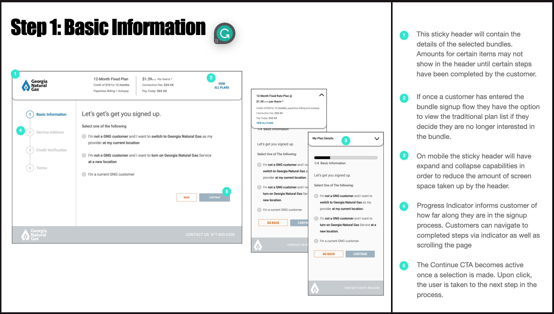
1. Expandable Sections
A mobile first pattern that allows customers to control how much they want to see. This reduces clutter and cognitive load.
2. Floating Plan Card
Shows essential plan information continuously.
Plan name, pricing, discounts, add ons, deposit, connection fee, and any promo code details are always visible.
3. IDentify Current GNG Customers IN FIRST STEP
Prevents current customers from beginning the PEW process and redirects them to the to the plan page for current customers.
4. Pre populated Address via MoEngage
Known customers have their address or contact data filled in automatically. This reduces repeated input and accelerates the experience.
5. Earlier Add On Enrollment
Paperless Billing enrollment now lives within the Contact Details step. Users must choose whether they want to enroll or not.
This increases visibility and improves adoption.
6. Clarified Turn On versus Switch Question
Redesigned wording to reduce confusion and prevent service delays.
7. Paperless Billing add-on
This add-on, formerly accessible after sign up only, is now part of the sign-up flow. Customer response here is not mandatory.
8. Transparent Connection Fee Management
Customers now receive disclosure and payment options within PEW rather than after becoming a customer.
This increases trust and reduces frustration.
9. Improved Abandon Cart Strategy
Customers who idle or attempt to exit receive contextual prompts based on what they have completed so far.
Wireframes


PEW 2.0 Mobile Wireframes Created in Figma
Abandoned Cart Flows


Abandoned Cart User Flows Created in Miro
Collaboration and Iteration
The client is highly engaged and very opinion driven. We worked through a weekly cycle of design, presentation, feedback, and revision.
Over three months, the wireframes went through many iterations until we achieved full client approval. In my opinion this time would have been better spent testing with actual or potential end users. I pushed for testing on multiple occasions and my request was denied by the client. However, I did manage to sneak in a few tests with some of my team members
Agency constraints required me to hand off the design to development and creative simultaneously. This meant managing alignment, responding to technical questions, and supporting implementation in real time.
Wrap-Up
The new website was launched in September of 2024 and my version of PEW active on the site and being used by almost 500,000 customers annually. while I don’t have access to post-launch data, the redesign tackled major usability pain points, setting GNG up for higher conversion rates, faster sign-up times and more customer engagement.
Problems solved with the implementation of PEW 2.0:
Some questions are ambiguously worded, making it difficult for users to provide accurate responses.
Responses to the Turn On or Switch question have been rephrased with the goal of easing confusion for the customer.
The wizard’s progress bar misrepresents the actual number of steps showing only five steps on load. Users are actually going through seven steps (basic flow), which creates a disconnect between expectations and reality.
Reconciled the progress bar so that it accurately reflects where the user is in the flow and how much further they have left to go.
Unclear details around the connection fee.
Clarified that payment options for the connection fee before exiting PEW.
Add-On enrollment happens only once the customer has finished the PEW journey.
Integrate add-ons into PEW.
Customers who have already provided their address before entering the wizard are still required to re-enter it.
Implemented a personalization/abandon cart strategy that remembers information (address, name, phone number) previously provided by the customer.
When a customer enters the wizard with a promo code, there is no clear indication that the discount has been applied until the final Review & Submit step. This lack of transparency can lead to frustration and decreased user confidence. Other details such as, the customers selected plan are hidden from the customer for the majority of their experience.
Introduced the floating plan bar that contains details such as the selected plan, add ons, and promotional codes/discounts.
Some customers are required to pay a connection fee in order to begin service with GNG. However, important details about that connection fee are not disclosed until after the customer has exited the PEW experience. This could cause frustration and lack of trust with new customers, decreasing the opportunity to gain their loyalty.
Provided the customer with the option to manage connection fee payments before exiting PEW and entering a legally binding agreement with GNG.
Paperless billing enrollment numbers are down. This is due to paperless billing enrollment happening only once the user has become a customer. This happens in the Account Preferences experience. More than 60% of customers were still receiving paper bills in the mail each month.
Introduced customers to Paperless Billing and Auto-Pay add-ons before the customer exits PEW.
Mobile Prototype
If the prototype video is inactive, try closing the tab and returning to the page


Desktop Images
Reflection
This project required balancing business goals, legal constraints, customer expectations, and backend limitations. It taught me to advocate for clarity and transparency even in highly regulated environments.
The final redesign offers a modern, user-centered, and mobile friendly experience that prioritizes transparency as a key component of customer trust. It simplifies the sign-up process while accommodating all necessary conditions, alternative paths, and technical complexities.
I am proud that the new PEW experience is being used by tens of thousands of new customers every month.