
Redesigning Landing Pages for Georgia Natural Gas
Overview
Client: Georgia Natural Gas www.gng.com
Company Mission: Provide natural gas service to over 1.9 million customers across residential, commercial, and industrial sectors in Georgia, USA.
Product: Landing Pages
Device Type: Mobile, Desktop
My Role: Senior UX Designer. I led the redesign of of landing pages during the full website overhaul. I was responsible for wireframes, concept development, creative collaboration, technical collaboration, and stakeholder alignment.
Discovery to Launch: 4 months
Products Used: Figma, Canva, Moengage, Jira, Teams, Outlook
Additional GNG Case Studies: Plan Enrollment Wizard
The Problem
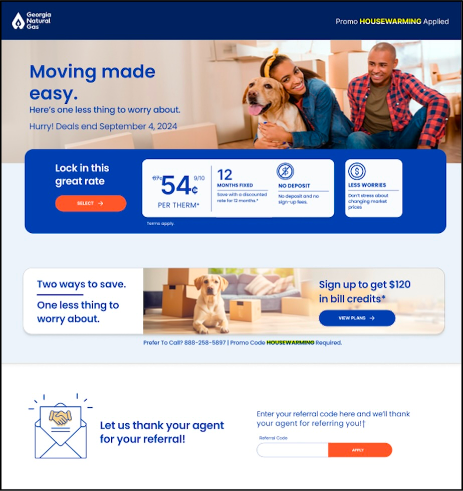
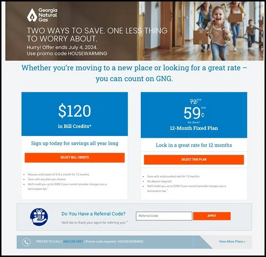
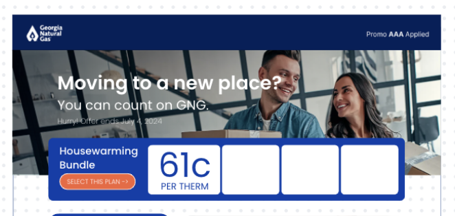
Landing pages are one of GNG’s main acquisition channels. There are as many as 25 active landing pages accessible to potential customers each month. The existing pages were visually outdated and created confusion because customers struggled to identify which offer was the primary offer, with certain pages containing full lists of plans. This reduced clarity and introduced friction at a critical conversion moment.
1: Competing Offers
Each landing page presents the customer with a minimum of two offers, with some pages containing full plan lists. This creates confusion as customers were unable to determine which offer was the primary offer making it less likely they’ll sign up for a plan
2: Lengthy Text Blocks
Some landing pages contained paragraphs of plan information for customers to read through. Increasing cognitive load on the user.
All pages included an unreasonably long disclosures section.
3: Outdated and Unintuitive UI
The visual design was clunky, severely outdated and unintuitive. Once users arrived on a landing page GNG had no way to determine if a user was a GNG customer or not
4: Misleading Information Architecture
Landing page layouts with 2 offers often placed the plans side by side on the screen, creating cognitive load and reducing the clarity of the comparison experience for users. In addition, there was essentially no hierarchy for CTA’s.
5: Customers Encouraged to Leave
GNG encourages customers to leave the page and “View More Plans”. This contributed to low conversion rates of landing pages
Discovery Process
For insights during the discovery phase, I leaned heavily on our stakeholders and the internal team that owned landing pages at GNG.
Key Insights From The Team
The primary need was to increase conversions. Landing pages consistently averaged bounce rates of 55% annually
There were strict regulatory requirements to adhere to. This meant we could not:
Remove the option to View More Plans.
Limit the number of offers shown on a page to one.
Landing Pages were broken up into 2 categories: Acquisition and Retention.
Movers and Partnership are subcategories of landing pages
Page headers and images needed to make more of an impact.
Ensuring brand marketing on partner pages was cohesive so customers experienced a seamless transition between partner messaging and GNG’s offer was essential
Fixed Rate plans (pay per unit used) were more popular among new customers, while Guaranteed Bill plans (pay the same amount monthly) were more popular with longer term customers
MoEngage Integration
During this time of the site redesign, our Strategy and Customer Experience team worked with GNG to integrate customer tracking tool, MoEngage, onto the new GNG site. The features we wanted. I collaborated with this team to talk about how the tool’s feature could be used to enhance GNG’s landing page experience. The MoEngage features we talked about implementing include:
Returning Customer Strategy
Returning visitors are 2 to 3 times more likely to convert than first time visitors. How can GNG get returning shoppers to convert?
Stronger offers?
Stronger language?
A/B test page layouts
Historically, GNG has not prioritized investing in user research so we felt this was the perfect opportunity to change that.
GNG would be able to test live from the site, using the findings to streamline landing page improvements.
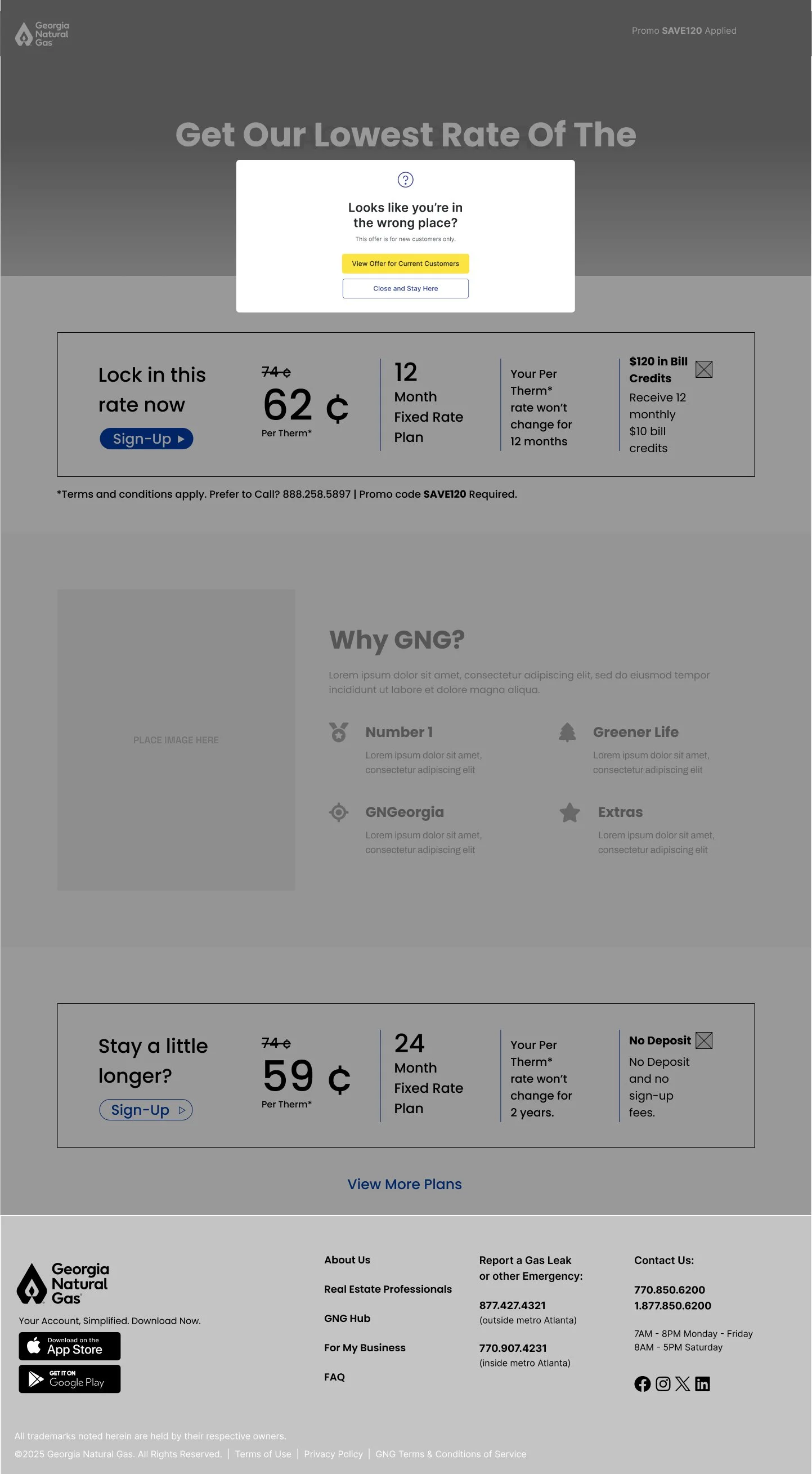
Re-Direct Modal
It’s common for current customers to end up on pages targeting non-customers. How can GNG help them get to the right place faster?
Wireframes
Objective
The new landing page designs should present a clearer, more direct landing page experience for customers and potential customers. Prioritizing plan and pricing transparency and fewer decision points for users.
The scenarios included:
1 plan page
2 plan page
2 plan page with offer selection in primary card
2 plan page with competitor comparison in primary card
Plan list page
Page with referral and termination fee modules
Partnership pages
Customer re-direct
Key Features
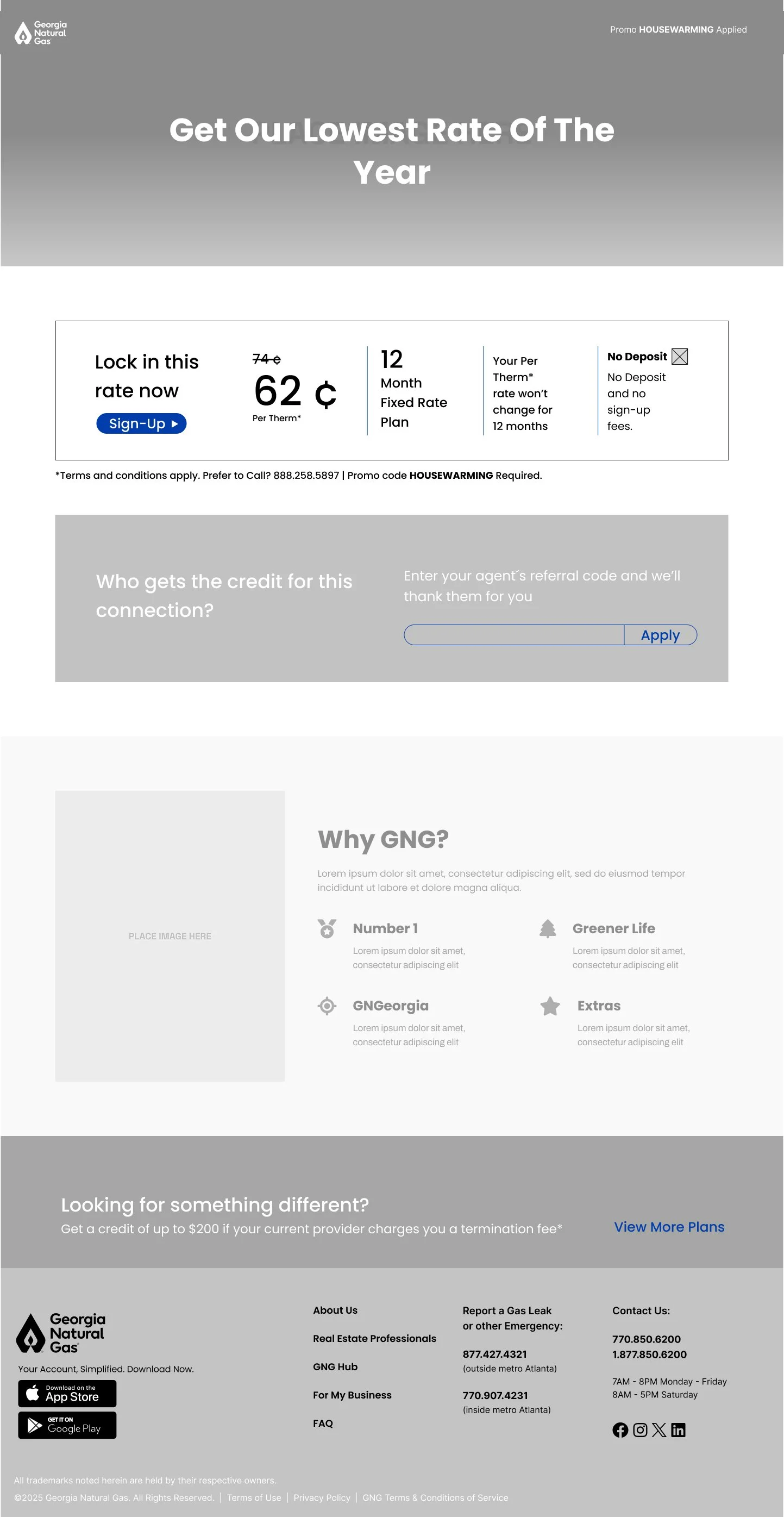
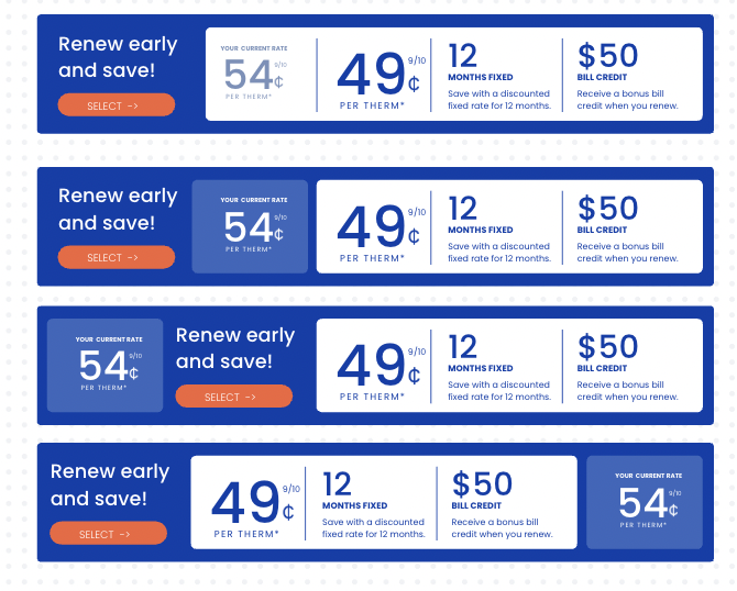
A primary plan card that distinguishes the primary plan from other offers present on the page
Note: This card format was established by our Creative Director. We’ll circle back to this later!Personalization integration with Moengage that identifies customers who land on an acquisition page or non customer who land on a retention page.
Modular sections that are easy to maintain
A Why GNG module that supports GNG’s mission and helps them to connect more meaningfully with customers and potential customers.
A clear hierarchy for CTA’s: Primary, Secondary, and Tertiary
Client Feedback on Wires
Header:
Though these were only wires, the client wanted to see headers from each category with copy and images
Note: Historically, each landing page category was assigned a designated image. Partnership pages each required a different image.
Primary Plan Card:
They thought it was “smart” and they liked the horizontal layout. However they wanted it to “attract more attention”.
There was some concern around how plan details would fit comfortably in the live setting, especially with the comparison version of the card.
Why GNG?:
They liked the idea of this new addition and wanted to see the area fully developed with copy.
Secondary Plan:
This plan was too far down on the page for the client. They wanted the secondary plan “above the fold” on desktop.
Moengage Re-direct Modal:
At this point, the client was not totally onboard with the modal. They wanted to learn more about Moengage and it’s capabilities before integrating modals into the experience.
Note: The MoEngage integration would impact other areas of the site, not just landing pages, so the modal was put on hold until the client determined how to move forward with this feature
Primary Plan Cards
Our Creative team was already in the process of standardizing plan cards across the site so before finishing the wireframes I connected with them to expand on the primary plan card for landing pages.
Earlier on in my process, I mocked up some plan cards in Canva based on the creative teams vision and now my main focus was finalizing the card variations and determining what information to show and when.
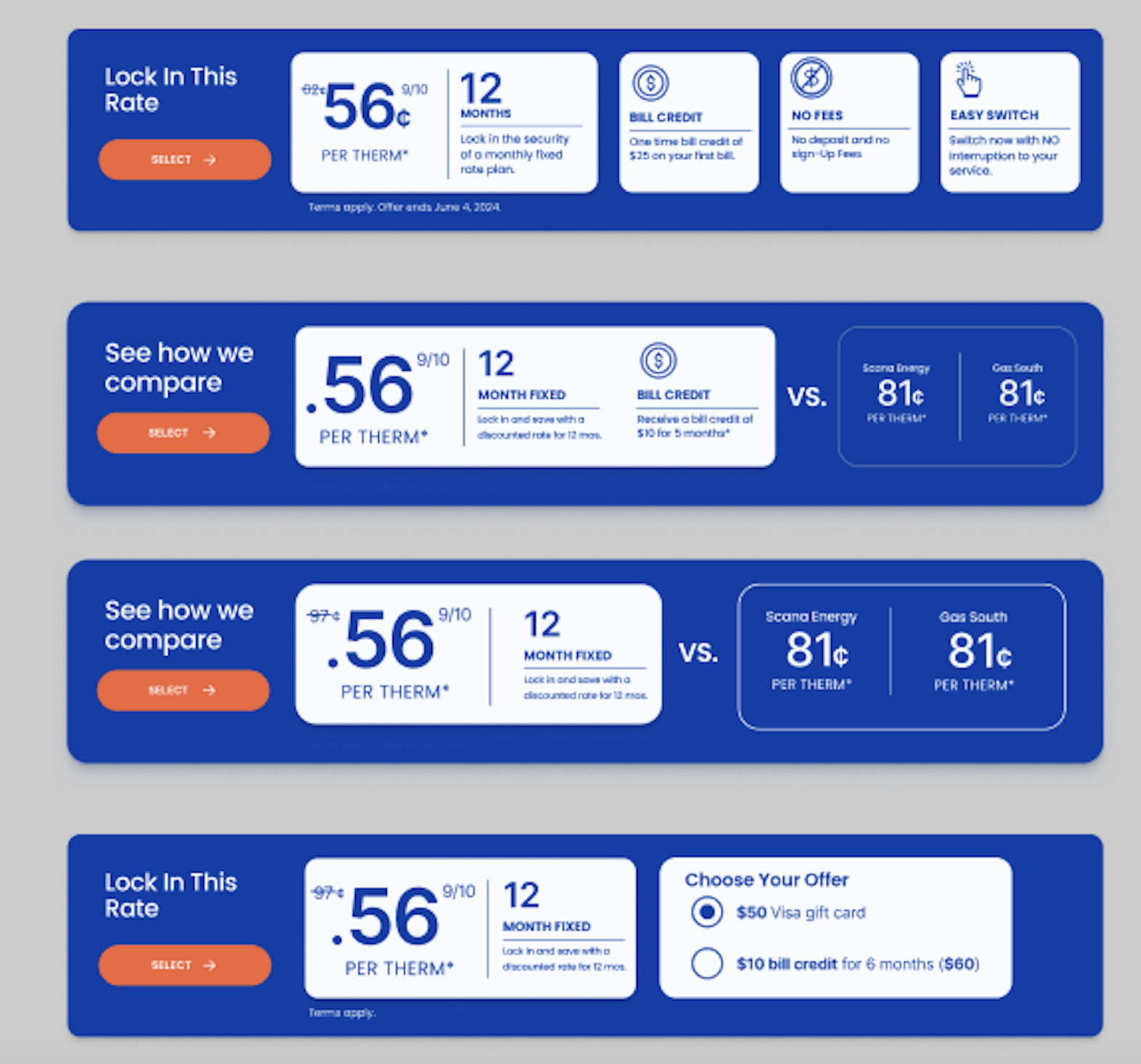
I took card design and created different variations of the primary plan card, accounting for the scenarios below:
Plan + Offer
Plan + Offer + Competitor Comparison
Plan + Offer Selection
Note: We presented the finalized plan cards to the client and I received the green light to incorporate them into the design.
Early
In-Progress
Final
Final Designs
After a month of weekly collaboration and feedback sessions with our client, we were aligned on page layout and flow. Additionally, with all legal requirements addressed, I was ready to move into high fidelity mock ups.
Note: The client ultimately decided not to proceed with the MoEngage customer re-direct modal.
Key Experience Features and Enhancements
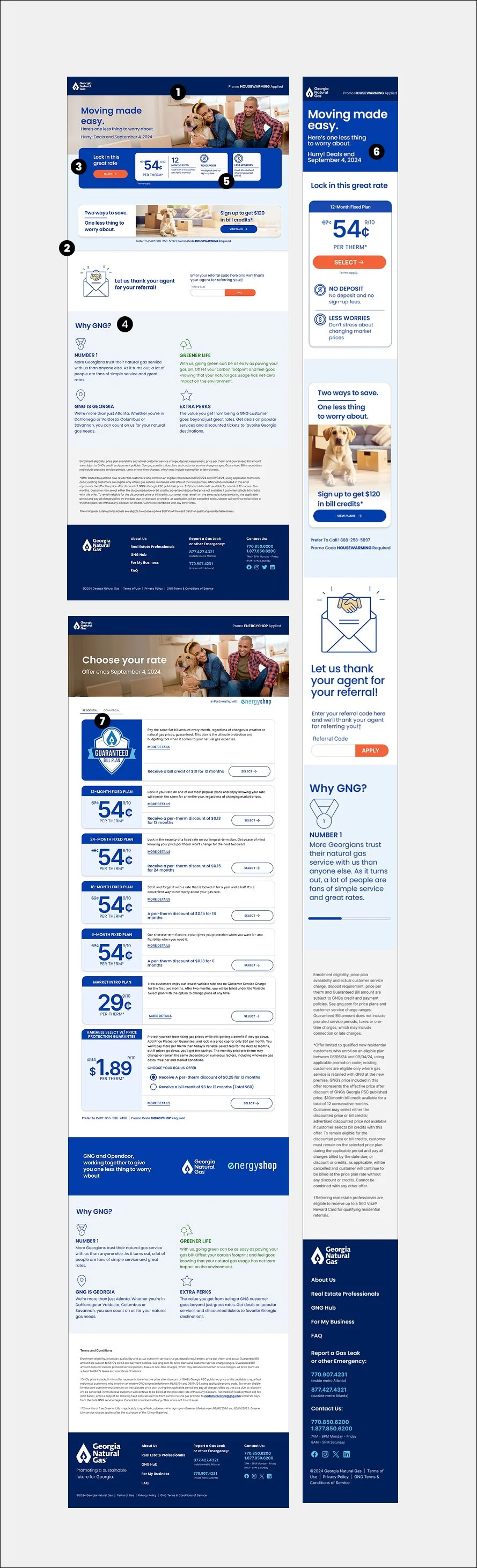
1. Updated Visual Design
Refreshed visuals modernized the experience while maintaining alignment with the GNG brand.
2. Improved Information Hierarchy
Content has been reorganized to prioritize the most important decision making opportunities information first. This helps users quickly understand the offer and reduces cognitive load as they scan the page.
3. Primary Plan Card
A single primary plan card anchors the experience and acts as the main conversion driver. This approach reduces choice paralysis while clearly communicating rate, term, and key benefits.
4. Why GNG? Module
The Why GNG module reinforces brand value and builds trust by clearly communicating GNG’s differentiators. It supports users who may need reassurance before committing to a plan.
5. Less Copy
The copy was intentionally reduced to focus on essential information only. This improves scannability and helps users move through the page with less friction.
6. Mobile Headers
To prevent accessibility issues in the mobile experience, images have been removed from the headers.
7. Plan List Toggle
The plan list toggle allows users to see only plans relevant to them when viewing landing pages that contain lists of plans.
Features that didn’t make this iteration of landing pages include:
Re-Direct Modal
Returning User Strategy
A/B Testing
Note: Though the client opted out of these MoEngage features, they did decide to implement the tool’s “abandon cart” strategy on landing pages.
Wrap-Up
With the final designs approved by GNG, I was able to hand over the Figma file to our developers. The new landing pages were launched in September 2024 with the redesigned site. This project required maintaining rapid momentum while balancing business goals, legal constraints, and customer expectations. I am proud that the new Landing Page experience is being used by tens of thousands of new customers every month.
Landing Pages as of September 2025:
Bounce rate decreased from 55 % to 39 %
Average time on page increased by 18%
Primary CTA click-through rate increased by 27%
Before & After
Eye Tracking Study
After the launch of Landing Pages, I became a member of the Interaction Design Foundation and enrolled in their AI for Designers course. Incorporating AI tools into the design process with the goal of expediting simple tasks or even expanding creativity is one of the topics explored in the course. Shortly after I obtained my certificate in the course, I wanted to “test” what I had learned and used AI to simulate a real life landing page eye tracking study with 100 “participants”. To run the study, I utilized RealEye.io and ran the test with the old and new versions of the HOUSEWARMING page. Below is the output from my study:
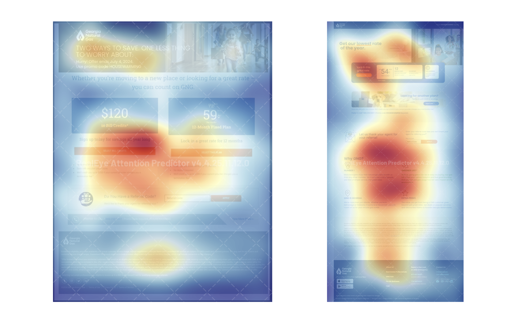
Old vs New Average Results
To take things a step further, I used ChatGPT to analyze the results and determine which landing page was the stronger of the 2.
Old landing page
• Two competing offers with equal weight
• Weak headline hierarchy
• Referral module placed too high
• Lower clarity around the primary call to action
New landing page
• Strong headline and subheader that anchor the value proposition
• A single dominant primary offer with a modernized plan card
• A supporting offer presented lower and with less visual weight
• Content reorganized to reduce friction and improve flow
• Modern, accessible layout aligned with the design system
Summary
The eye tracking study indicated that user attention was heavily concentrated on the primary plan card and CTA in the new design, validating the redesigned hierarchy successfully directed user focus to the core conversion elements. Secondary content below the fold received significantly less attention, suggesting reduced cognitive load and fewer distractions during decision making. Overall, the visual flow supported quicker scanning and a clearer path to action.
Even though this was a simulated study, the attention patterns align with established usability principles and support the design direction taken.
Disclaimer: I would not rely on AI study findings in the real world, I am an advocate for taking the proper channels to validate or invalidate findings, designs, assumptions, etc.