
Service Level Objective Dashboard
Company: The Home Depot
Team: Enterprise
Product: Service Level Objective Dashboard
Platform: Desktop
Role: UX Designer. As the UX Designer on the SLO Dashboard, I led research, design, and testing to create a centralized monitoring experience for Reliability Engineers.
Tools: Sketch, Marvel
The Problem
At The Home Depot, each enterprise team built and maintained its own service monitoring application, with access typically limited to that team. As a result, Reliability Engineers did not have direct visibility into many critical services and were often required to reach out to individual teams to obtain status or performance information. During incidents, this reliance on manual communication slowed diagnosis, increased cognitive load, and introduced unnecessary friction at moments when speed and clarity were critical.
“As a Reliability Engineer, I need to be able to monitor the health of my app in an efficient and easy to comprehend process.”
In high pressure situations, engineers needed immediate answers to questions like:
Which services are currently at risk
Whether issues are isolated or systemic
How performance is trending over time
Which teams need to be engaged
The existing approach made answering these questions difficult and time consuming.
Why This Mattered
HomeDepot.com supports thousands of users and millions in transactions daily. Even brief performance issues or service interruptions can have a significant impact on revenue and customer trust.
Without centralized access to service health data, incident response depended heavily on tribal knowledge and real time coordination between teams. This increased response times and made it harder to maintain consistent reliability standards across the organization.
Research and Discovery
Observation and User Interviews
I conducted shadowing sessions and interviews with end users to understand how the engineers monitored services, how they responded to incidents, and where the current workflow broke down.
Who:
4 Internal Site Reliability Engineers
6 Internal Sr. Site Reliability Engineers
5 Teams
Key Insights Included:
End users indicated that the first sign of a problem is usually elevated latency
This is when the investigation typically begins
Engineers often did not know which team to check with first
Access constraints forced engineers to rely on Slack or email during incidents
Keeping information siloed prevented teams from taking action immediately
Time spent gathering information delayed action
It was common for engineers to have to make contact with multiple teams before reaching the correct team
Wait times during initial contact ranged from 30 seconds to up to more than an hour in isolated incidents
More than 50% of users shared concern around abandoning their monitoring service for the upcoming service
Teams placed a high level of trust in the reliability of their own services
Most team services had no way exporting data
This made it difficult for engineers when building service reports for management and leadership
The Solution
The Service Level Objective (SLO) Dashboard would provide a single, centralized view of service level objectives and key performance indicators across enterprise teams.
Key features needed in the experience :
A unified view of service availability, latency, and error rates
Consistent metrics and terminology across services
Visualizations that highlighted trends and anomalies over time
Tables that allowed engineers to compare service health at a glance
Filters to focus on specific services, teams, or time ranges
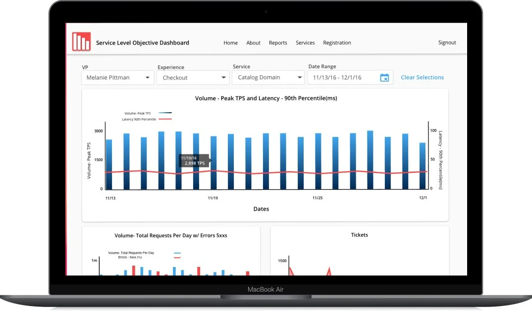
Metrics Tracked
Volume - Daily Requests, Volume - Peak TPS, Latency, Overall Availability, Orders, and Tickets
Established by the business but also most asked for by users
Users wanted Volume metrics visualized together
This approach reduced the need for manual outreach and allowed engineers to independently assess system health during incidents.
Design Process
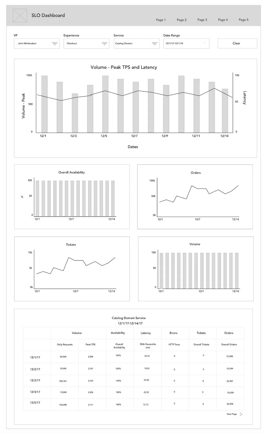
Wireframe A
Wireframes and Prototyping
I explored multiple layout directions, balancing information density with readability. Early concepts focused on surfacing critical signals first, then progressively revealing supporting details.
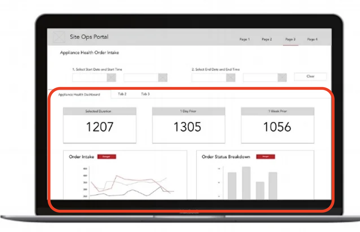
I previously designed a monitoring dashboard for another team so I incorporated parts of that design into some of the early designs.
Based on research findings, the wire designs were guided by the following principles:
Centralize access to relevant service health data
Reduce reliance on team specific tools and knowledge
Make service status and risk immediately visible
Support both high level scanning and deeper investigation
Prioritize clarity over data volume
User Testing and Iteration
I conducted A/B testing of Wireframe A and the previous design with the same group of engineers I conducted my initial research with.
Previous Design
Key Insights Included:
Users overwhelmingly expressed that having the data table at the top of the page was preferred to having data visuals at the top of the page.
Users also wanted to more visual cues on the table, specifically calling out metrics at abnormal levels
Wireframe A was the preferred choice of 80% of users
Even though they were happy with the proposed design, there was still a feeling of mistrust in a new system among the engineers
MVP
Features Included in The MVP:
All service teams and their Service Level Objective metrics available in the SLO Dashboard
Volume - Daily Requests, Volume - Peak TPS, Latency, Overall Availability, Orders, and Tickets
Ability to visualize multiple metric together
Custom date range selection
Custom layouts with drag and drop
Ability to edit metrics
Trust in the SLO dashboard needed to be built. This way the engineers could compare their legacy systems to the new one and check for accuracy and edit only when necessary. However, this was not a forever solution as those legacy systems would eventually be phased out.
Outcome
The SLO Dashboard replaced the need for engineers to navigate multiple team owned monitoring tools during incidents. Engineers gained direct access to service health data in one place, improving situational awareness and reducing time to diagnosis.
The dashboard was recognized multiple times across the technology organization. The CEO of Technology also wrote about the impact of the SLO dashboard in the monthly newsletter.
I’m most proud of the fact that the product won the trust of the Engineers and was being used by all of the 200+ engineering teams within 6 months of it’s release.
While formal metrics were not captured, qualitative feedback indicated that the dashboard made it easier to:
Understand overall system health
Identify at risk services more quickly
Compare performance across teams
Respond to incidents with greater confidence
The SLO Dashboard saved The Home Depot millions ($) in lost revenue due to service interruptions

Post Project Iteration
After the project wrapped, I revisited the SLO Dashboard independently to explore how the design could evolve based on lessons learned.
This iteration focused on:
Further reducing ambiguity in service statuses
Improving visual hierarchy within dense data tables
Better aligning the interface with how engineers navigate incident repair
Although not part of the original scope, this exploration demonstrates how my thinking around monitoring tools and cognitive load continued to mature beyond delivery.